
| 일 | 월 | 화 | 수 | 목 | 금 | 토 |
|---|---|---|---|---|---|---|
| 1 | 2 | 3 | 4 | 5 | 6 | 7 |
| 8 | 9 | 10 | 11 | 12 | 13 | 14 |
| 15 | 16 | 17 | 18 | 19 | 20 | 21 |
| 22 | 23 | 24 | 25 | 26 | 27 | 28 |
Tags
- react
- 자료구조
- GIT
- next.js
- 개발자취업부트캠프
- 내일배움카드
- 프론트엔드
- CSS
- 모던 딥 다이브 자바스크립트
- 패스트캠퍼스
- JavaScript
- 코딩테스트
- MegabyteSchool
- 자바스크립트
- 국비지원교육
- 프로그래머스
- 이벤트
- 메가바이트스쿨
- 모던 자바스크립트 딥 다이브
- 리액트
- 공식문서
- Github
- TypeScript
- 비전공자
- styled-components
- 알고리즘
- 입문
- useMemo
- useRef
- 개발 공부
Archives
- Today
- Total
개발 기록 남기기✍️
Styled-Components (2) - Adapting and Extending 본문
Checkpoint 1
styled-component를 사용해서 색상이 다른 Box 두개를 만들어보겠다.
import styled from "styled-components";

const Father = styled.div`
  display: flex;
`;

const Box1 = styled.div`
  background-color: teal;
  width: 100px;
  height: 100px;
`;

const Box2 = styled.div`
  background-color: orange;
  width: 100px;
  height: 100px;
`;

function App() {
  return (
    <Father>
      <Box1 />
      <Box2 />
    </Father>
  );
}

export default App;
정상적으로 작동하지만, Box1과 Box2에서 background-color를 제외하고는 모든 코드가 일치하는 것을 볼 수 있다. 코드를 간결하게 하기 위한 방법이 필요하다.
${(props) => props.name}
props를 이용해서 코드를 더 간결하게 할 수 있다.
import styled from "styled-components";

const Father = styled.div`
  display: flex;
`;

const Box = styled.div`
background-color : ${(props) => props.bgColor};
width: 100px;
height: 100px;
`

function App() {
  return (
    <Father>
      <Box bgColor="teal" />
      <Box bgColor="orange" />
    </Father>
  );
}

export default App;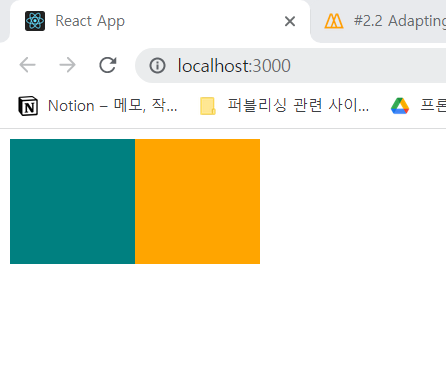
똑같이 정상적으로 동작하는 것을 확인할 수 있다.
Box라는 컴포넌트 안에 background-color : ${(props) => (props.bcColor}형식으로 props를 집어넣어 원하는 속성만 변경할 수 있다.
Checkpoint 2
Box와 다른 속성은 같고 border-radius가 다른 Circle 도형을 만들어보려고 한다.
import styled from "styled-components";

const Father = styled.div`
  display: flex;
`;

const Box = styled.div`
  background-color: ${(props) => props.bgColor};
  width: 100px;
  height: 100px;
`;

const Circle = styled.div`
  background-color: ${(props) => props.bgColor};
  width: 100px;
  height: 100px;
  border-radius: 50px;
`;

function App() {
  return (
    <Father>
      <Box bgColor="teal" />
      <Circle bgColor="gray" />
    </Father>
  );
}

export default App;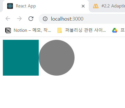
마찬가지로 정상적으로 동작하지만, 우리는 이 코드를 더 간결하게 만들 수 있지 않을까?
styled(Name)
Circle 컴포넌트 안에 Box 컴포넌트 속성을 담아줄 수 있다.
import styled from "styled-components";

const Father = styled.div`
  display: flex;
`;

const Box = styled.div`
  background-color: ${(props) => props.bgColor};
  width: 100px;
  height: 100px;
`;

const Circle = styled(Box)`
  border-radius: 50px;
`;

function App() {
  return (
    <Father>
      <Box bgColor="teal" />
      <Circle bgColor="orange" />
    </Father>
  );
}

export default App;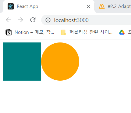
Circle에 styled.div를 입력하는 대신 styled(Box)처럼 가져올 컴포넌트를 입력하면 Box의 속성을 그대로 갖다 쓸 수 있다.
'Front-End > React' 카테고리의 다른 글
| [React] 공식문서 정리 - 주요 개념(2) (0) | 2023.02.02 |
|---|---|
| [React] 공식문서 정리 - 주요 개념(1) (0) | 2023.02.01 |
| Styled-Component(4) - Animation and Pseudo Selectors (0) | 2022.12.09 |
| Styled-Components (3) - "As" and Attrs (0) | 2022.12.09 |
| Styled-Components (1) (0) | 2022.12.09 |
'Front-End/React' Related Articles
more


